Creating Stunning Ombre Quilts Techniques Patterns and Color Combinations
Choose a color palette that transitions seamlessly from light to dark shades. Consider selecting fabrics in cotton or linen, which not only provide comfort but also enhance the visual effect. A good starting point is to use a basic color wheel to find complementary hues.
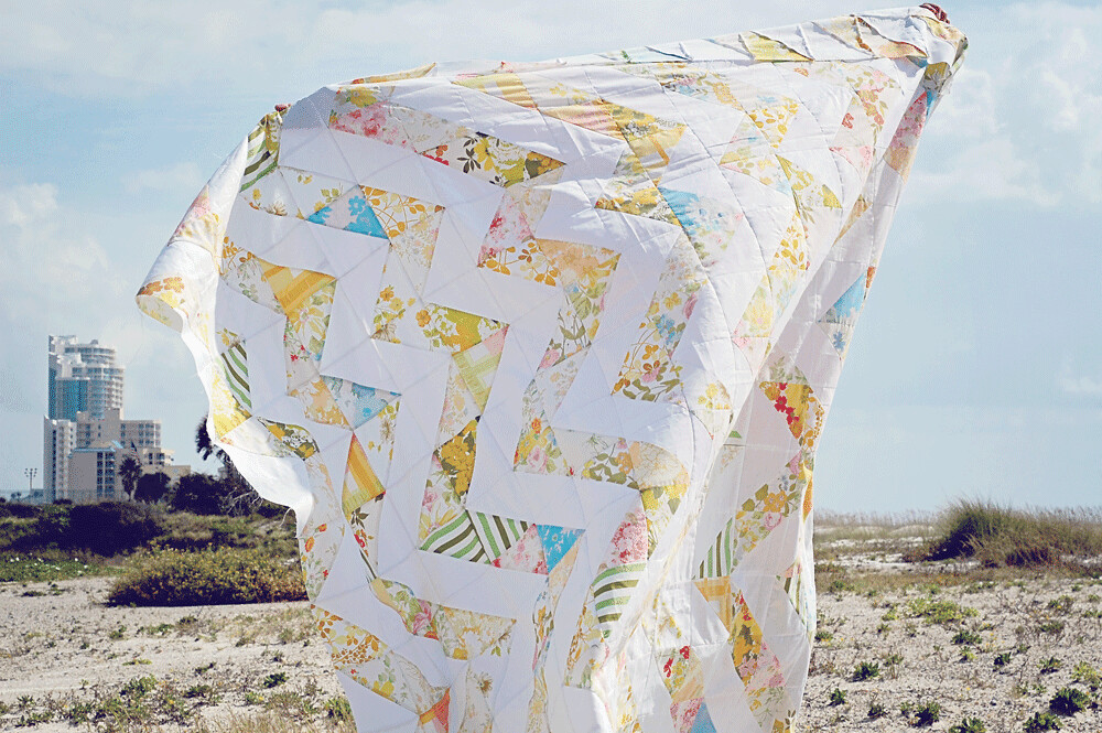
Cut your fabric into strips of varying widths to add depth to your project. Start with wider strips in the lightest shade and gradually decrease the width as you move towards the darker tones. This layering technique creates a captivating visual flow that draws the eye.
Experiment with different stitching techniques to accentuate the gradient effect. A simple straight stitch can be effective, but incorporating a zigzag or decorative stitch adds texture and intrigue. Play around with the thread color as well; a contrasting thread can highlight the transitions beautifully.
Finally, choose a backing material that complements the front design without stealing the spotlight. Solid colors or subtle patterns work best, as they support the overall aesthetic while keeping the focus on your carefully crafted gradient scheme.
Choosing the Right Fabrics for Your Ombre Quilt
Selecting the ideal materials is critical for a stunning transition effect. Consider these factors:
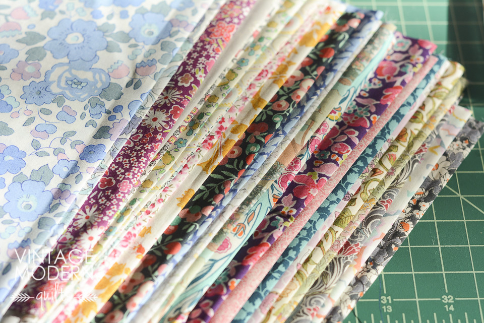
- Color Gradation: Choose fabrics that blend seamlessly. Look for a gradient set from light to dark shades or analogous colors.
- Fabric Type: Natural fibers such as cotton or linen are preferred for their durability and ease of handling. They tend to hold dye well, enhancing the color transitions.
- Weight: Opt for medium-weight fabrics to ensure that the quilt drapes nicely without feeling bulky.
- Texture: Mixing textures can add depth. Combine smooth cotton with lightly textured fabrics for visual interest.
- Print Patterns: While solid fabrics are popular, subtle prints can add richness. Avoid overly busy patterns that detract from the gradient effect.
- Pre-Washing: Always pre-wash materials to prevent shrinkage and color bleeding, ensuring the final piece maintains its integrity.
Experiment with swatches before finalizing selections, ensuring that the colors blend harmoniously and match your intended design.
Understanding Color Gradients and Their Effects
Choose a color wheel to visualize transitions. This tool helps identify harmonious combinations and the emotional responses colors elicit. For instance, blue tones convey calmness, while warm colors like orange stimulate energy.
Experiment with gradual shifts in hues to create depth. Use a light color gradually deepening to a darker shade, fostering a sense of movement across your pieces. This technique encourages the eye to travel along the quilt, enhancing its visual appeal.
Consider temperature when selecting colors. Cool colors recede, making spaces feel larger, while warm colors advance, creating intimacy. Mixing these temperature variations can add dynamism to your designs.
Proportional balance is key. Larger areas of darker shades can ground your creation, while smaller accents of lighter hues can draw attention without overwhelming. Aim for a pleasing ratio to maintain cohesion.
Don’t shy away from contrasting colors. They can amplify the gradient effect, creating striking visuals. Pair complementary tones to enhance vibrancy and add interest to your artwork.
Test your selections in different lighting conditions. Natural light can significantly alter how colors overlap. Adjusting your palette based on these observations can lead to more satisfying outcomes.
Utilize fabric types thoughtfully. Different materials can affect how colors appear. For example, matte surfaces absorb light, while glossy fabrics reflect it, changing the overall perception of tones.
Keep a reference board with color swatches to guide selections. This will assist in visualizing how specific gradients will play out across your design, ensuring each piece aligns with your envisioned theme.
Planning Your Quilt Layout for Maximum Impact
Begin with a color palette. Select a range of shades that transition smoothly from light to dark or vice versa. This gradient will visually guide the viewer’s eye across the fabric. Use a color wheel to choose complementary or analogous colors for a harmonious arrangement.
Opt for a focal point. Each design should have an area that captures attention. Place the most contrasting fabrics or a unique block in a central position, ensuring it draws interest from all angles.
Consider block size. Larger pieces will create a bolder impact, while smaller blocks offer more intricate patterns. Strive for a balance that highlights the ombre effect without overwhelming the overall design.
Experiment with layout arrangements. Utilize vertical or horizontal orientation to influence the perceived space. Diagonal patterns can add dynamism, while horizontal layouts may evoke stability.
Incorporate negative space. Leaving areas of unembellished fabric can enhance the overall design and accentuate the transition between colors. This technique invites the viewer to appreciate each shade individually.
Test arrangements with mock-ups. Lay out fabric pieces on a flat surface, or use digital tools to visualize different configurations. Adjusting placements beforehand can save time during the sewing process and ensure a cohesive appearance.
Finally, consider the quilt’s intended setting. Evaluate how lighting in the chosen space will interact with the colors. Fabrics may appear differently under varying conditions, so choose tones that resonate with the ambiance of the environment.
Techniques for Seamless Color Transitions
Utilize a color gradient chart to guide your fabric selection. This allows for a smooth transition by ensuring that each chosen fabric swatch flows harmoniously into the next. Group your fabrics in order of hue, intensity, and saturation to visualize the potential blend.
Fabric Manipulation
Cut pieces at varying angles to create a dynamic overlay effect. Add a slight curve to the edges of your fabric pieces to amplify the visual softness of the transition. Avoid straight lines where possible to maintain a fluid motion between colors.
Stitching Techniques
Apply a technique known as “fade stitching,” where stitching lines gradually shift in color to match the fabrics being sewn. This subtle approach can enhance the overall flow and integration of colors. Consider using a free-motion sewing technique for an organic feel.
Experiment with layering fabrics through a method called “shadowing,” placing a lighter shade over a darker shade to create dimension. This can visually enrich the color gradient and elevate the overall design.
Regularly step back and observe your work from a distance to assess the flow of colors. Adjust pieces accordingly to ensure the transitions look natural and fluid as you progress.
Selecting the Best Stitching Methods for Durability
Opt for a straight stitch with a medium-length setting (around 2.5 to 3.0 mm) to ensure strong seams. This stitch type can withstand the stress of everyday use, making it ideal for your project.
Utilize double stitching on high-stress areas such as corners and borders. This method reinforces these sections, enhancing overall longevity.
Consider using a zigzag stitch along the raw edges to prevent fraying. This technique is especially beneficial when working with fabrics prone to unraveling.
When piecing together fabrics, select a quarter-inch seam allowance. This standard provides a balance between durability and fitting precision without compromising fabric integrity.
Employ backstitching at the beginning and end of seams to prevent unraveling. This additional layer adds strength where it is most needed.
For heavier materials, a walking foot attachment helps evenly guide multiple layers through the machine, minimizing puckering and ensuring even stitches.
Use a thread that matches the fabric weight and type. Polyester threads generally offer greater strength and elasticity compared to cotton, making them a suitable choice for various applications.
After stitching, conduct a test run to assess the seam strength. Pull gently to check for any weaknesses before proceeding with the final assembly.
Adding Finishing Touches to Enhance Your Quilt
Consider incorporating unique binding techniques to elevate the overall appearance. A double-fold binding adds an extra layer of texture and durability. Choose a contrasting fabric to frame your project, creating a striking boundary that draws the eye.
Personalized Labels
Add a customized label to signify your work. Include the date, your name, and a short message. This touch transforms the piece into a cherished heirloom, making it more personal and meaningful.
Quilted Accessories
Create coordinating accessories such as pillow covers or table runners using leftover fabric. This approach not only utilizes scraps but also enhances the theme throughout your living space, ensuring a cohesive look.
Q&A: Ombre quilt
How can ombre fabric be used in a quilt pattern to create a striking ombre look across the quilt top?
Ombre fabric gradually shifts in color from light to dark, making it ideal for creating an ombre look in a quilt pattern. By arranging pieces from the lightest to the darkest within each block or row, quilters can achieve a smooth color transition across the quilt top. This effect works especially well in triangle or half square block layouts and enhances the visual movement of the finished quilt.
What makes an ombre puff quilt unique compared to traditional quilt designs using standard fabric collections?
An ombre puff quilt features three-dimensional texture and color flow by using ombre fabric within each puff or square. Unlike flat quilts, this design adds volume while showcasing the gradual color shift. Quilters often use a fat quarter bundle of coordinated ombré tones to maintain consistency. The resulting finished quilt has both tactile appeal and a modern ombre design.
Why is a fat quarter bundle useful when creating an ombre confetti or rainbow-themed quilt top?
A fat quarter bundle provides a curated range of colors, making it easier to build a cohesive rainbow or ombre confetti quilt top. Each fat quarter offers enough fabric for multiple pieces while showcasing different points in the ombre spectrum. This variety allows quilters to balance light and dark values across the quilt design without sourcing from a large stash of different fabric.
What tips from a tutorial or Pinterest post can help when choosing the right ombres for a throw size quilt pattern?
Tutorials and Pinterest posts often suggest starting with the darkest shade in the center or corners and working toward lighter tones to guide color placement. They also recommend selecting ombre fabric from the same fabric collection to ensure harmony. For a throw size quilt pattern, laying out pieces before sewing helps visualize the color flow and confirm the desired ombre effect across the entire quilt top.